REEPERBAHN

TITLE ANIMATION
↝ DESCRIPTION
It
was a pleasure for us to be asked by Reeperbahn Festival to create the
concept, design, art direction and animation for their 2016 opening
title sequence.
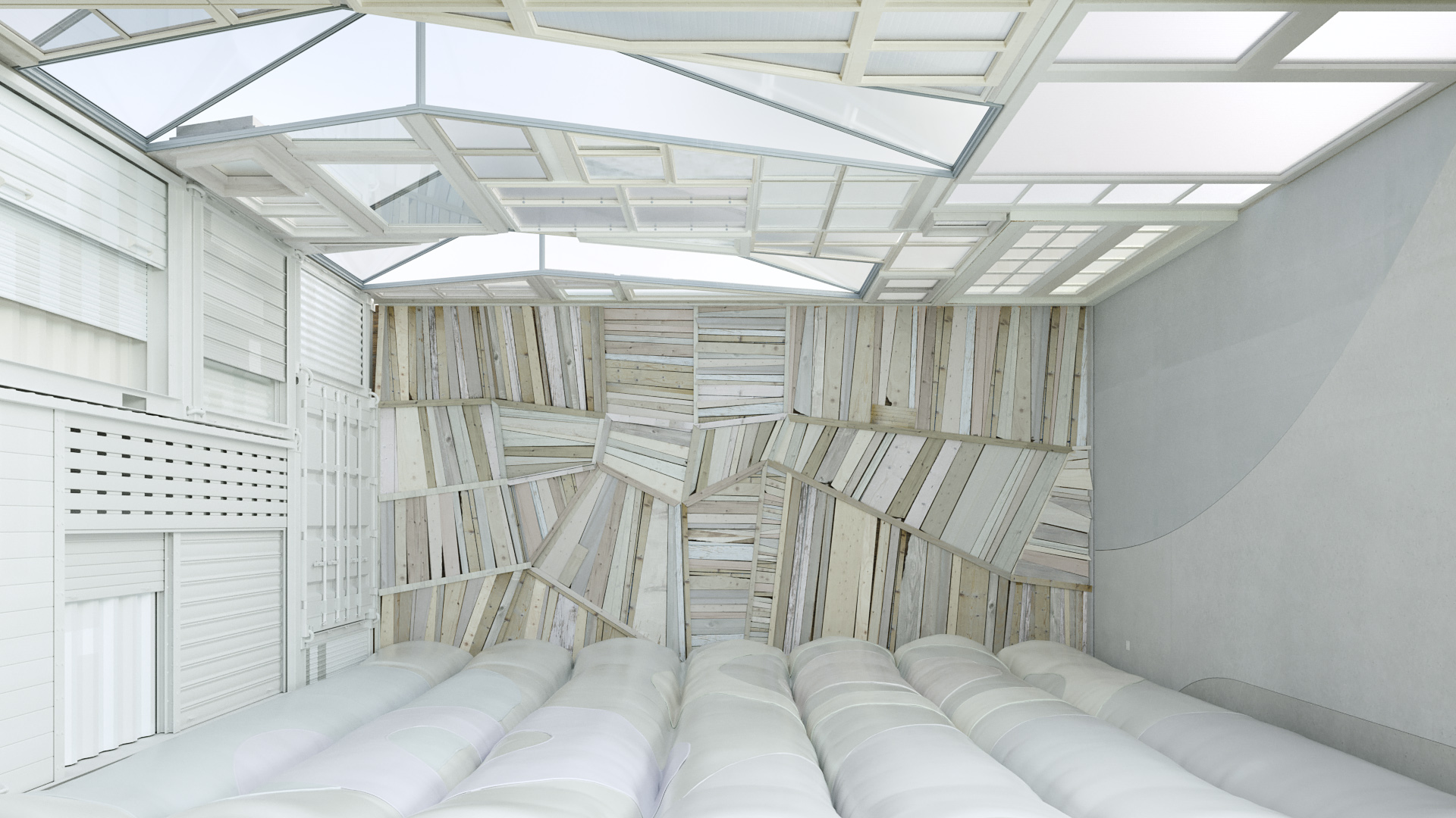
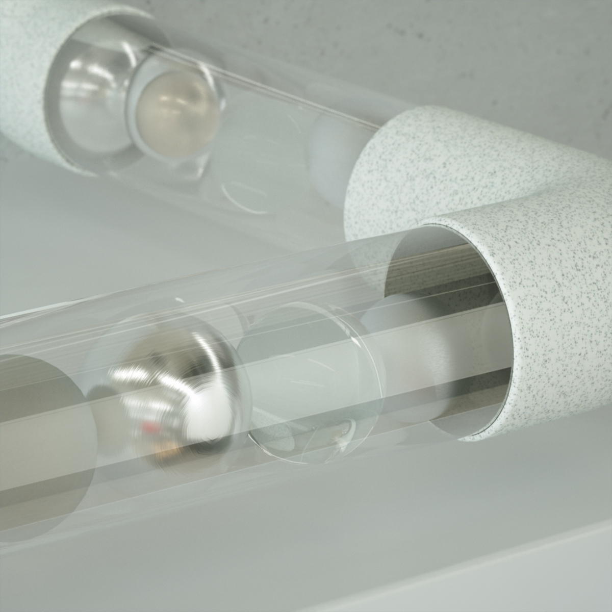
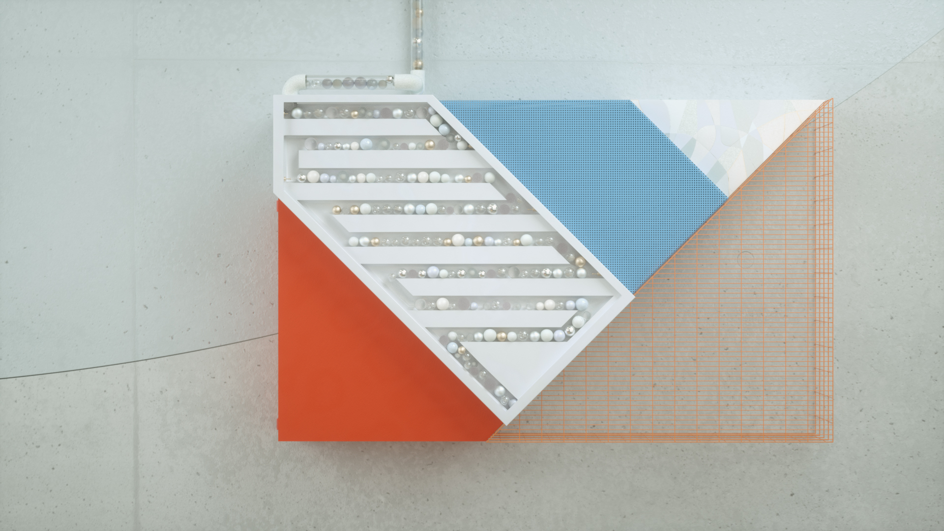
There are more than 700 events in over 70 locations in just 4 days. So we wanted our concept to reflect the great variety of the festival through moving cube with different sides, each side representing a different topic of the festival in the middle of Hamburg. Playful moving objects occupy the space and bring live into spatial diversity. The moving objects represent festival visitors: They queue up, wait till the lights turn of and the music starts, relax, meet and greet, have drinks, jump around and dance.
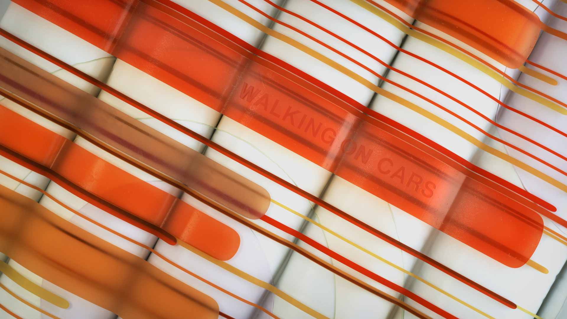
The approach was to start and end rather 2Dish graphical and explore the space in 3D. Every single shape you see in the trailer, like the walls, the arrangement of the windows, even the objects and the graphics are extracts from the CI pattern we’ve got from the client. The colour concept was a tricky part. Blue and orange are contrasting colours, so we had to handle them with care. Therefore just the hero objects got coloured and highlighted all at once. We incorporate typography and logo into the scene by using projection on the walls.
There are more than 700 events in over 70 locations in just 4 days. So we wanted our concept to reflect the great variety of the festival through moving cube with different sides, each side representing a different topic of the festival in the middle of Hamburg. Playful moving objects occupy the space and bring live into spatial diversity. The moving objects represent festival visitors: They queue up, wait till the lights turn of and the music starts, relax, meet and greet, have drinks, jump around and dance.
The approach was to start and end rather 2Dish graphical and explore the space in 3D. Every single shape you see in the trailer, like the walls, the arrangement of the windows, even the objects and the graphics are extracts from the CI pattern we’ve got from the client. The colour concept was a tricky part. Blue and orange are contrasting colours, so we had to handle them with care. Therefore just the hero objects got coloured and highlighted all at once. We incorporate typography and logo into the scene by using projection on the walls.
Stills︎︎︎


↝ credits