COMDIRECT

BANK UI.
↝ DESCRIPTION
We were honoured being asked by the
German bank, Comdirect, to create a short animation for an online
campaign — aimed at attracting and recruiting UI-designers.
Our idea was to create a bunch of action-reaction based animations. The very first concept was based on the idea of pushing, shifting, scrolling and clicking various buttons triggering a diverse mix of animations. We then worked up different metaphors for dealing with money and at the same time used keywords the client had provided us. During the process the client fell in love with all the little “reaction” stories so we ended up stitching them together to create a seamless narrative — open to interpretation and detached from conservative visualisations so often associated with banks.
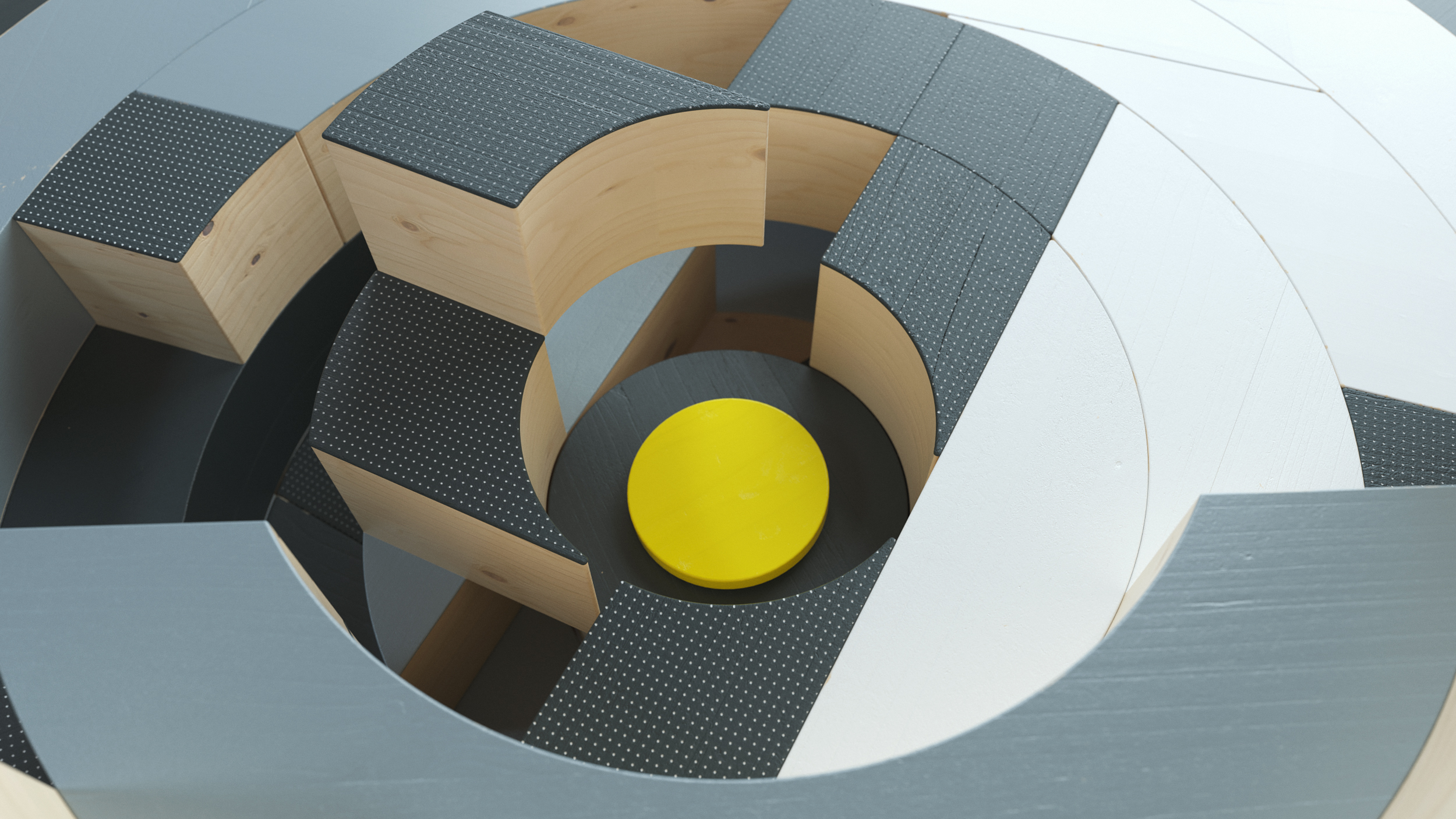
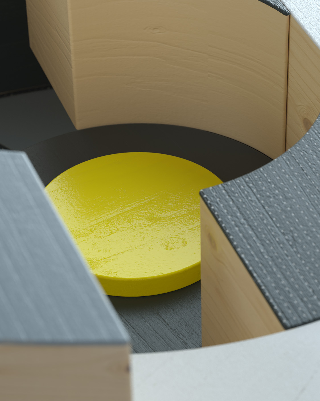
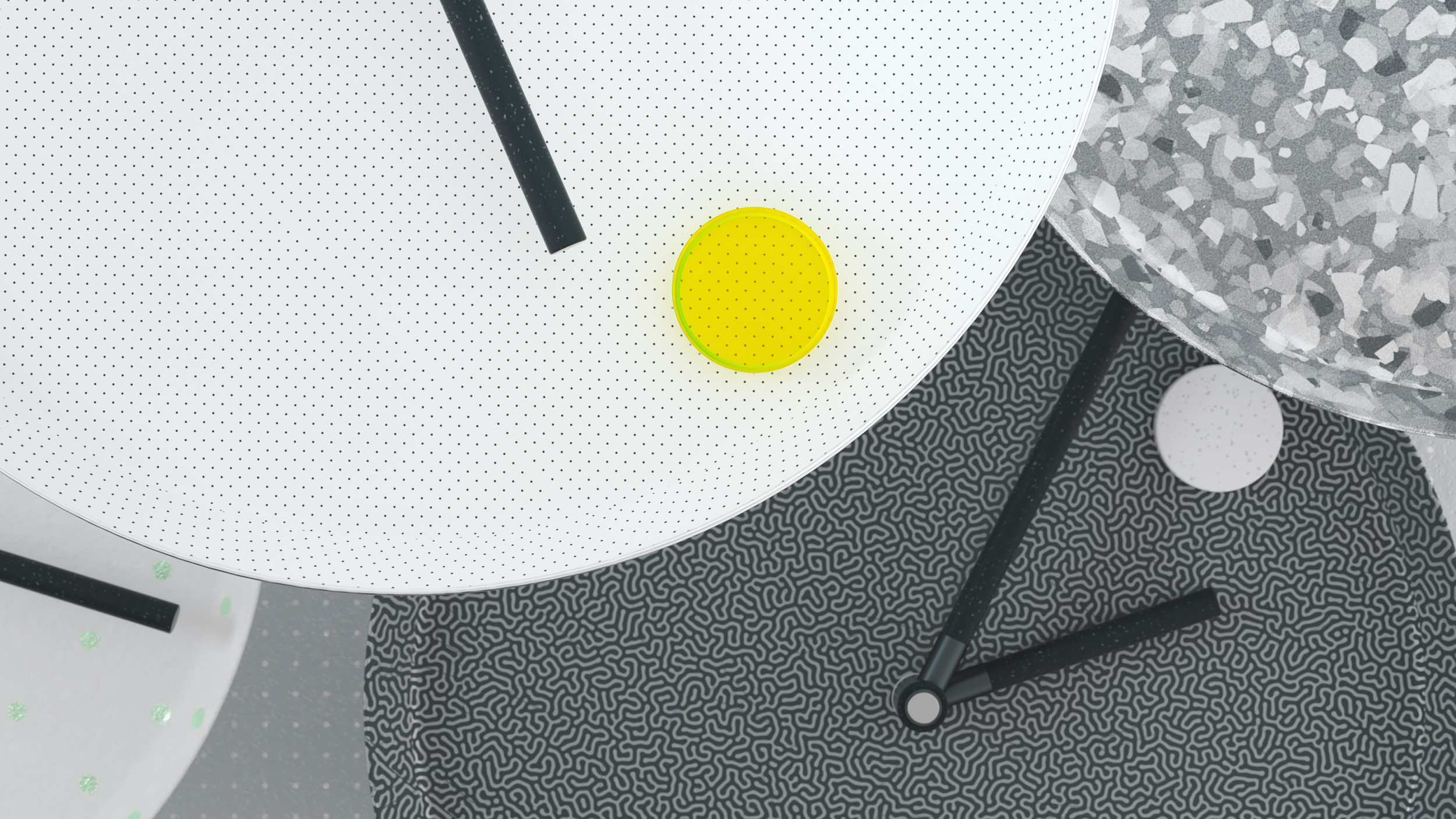
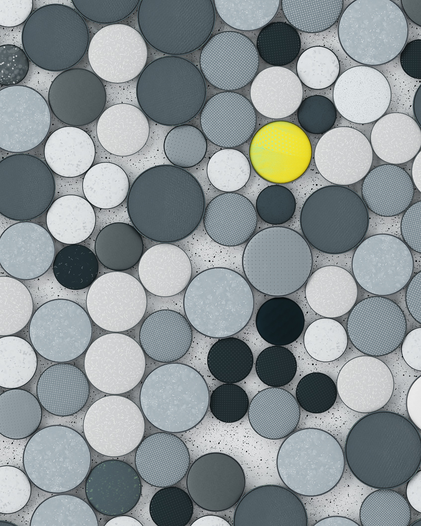
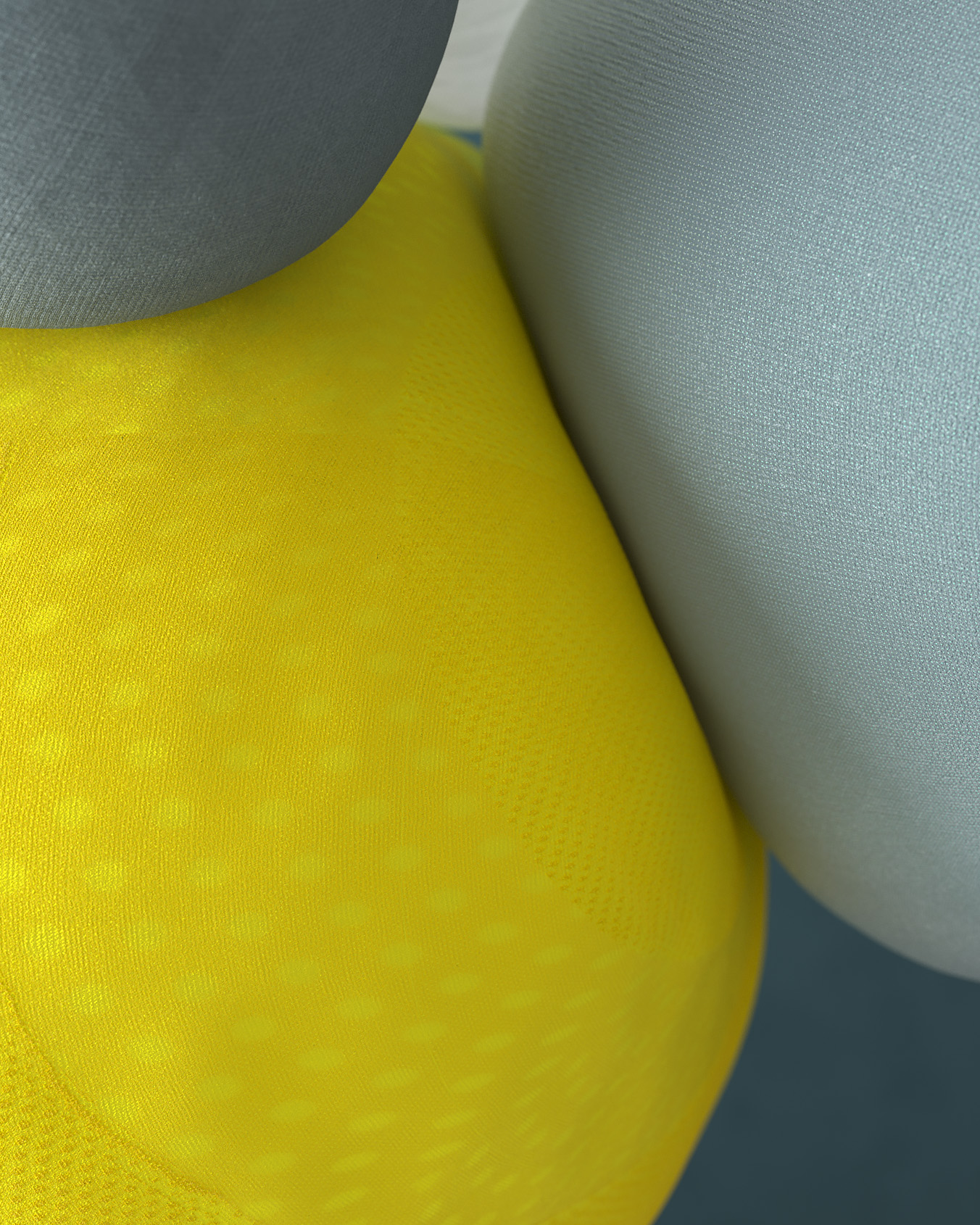
The colour palette is based on the new CI of Comdirect, predominantly anthracite and grayscale. Yellow acts as the highlight colour with a gradient to green drawing the viewer’s attention to the stories’ heroes. The environment is based on dots, points and circles inspired by visual language used in the world of stock markets.
Our idea was to create a bunch of action-reaction based animations. The very first concept was based on the idea of pushing, shifting, scrolling and clicking various buttons triggering a diverse mix of animations. We then worked up different metaphors for dealing with money and at the same time used keywords the client had provided us. During the process the client fell in love with all the little “reaction” stories so we ended up stitching them together to create a seamless narrative — open to interpretation and detached from conservative visualisations so often associated with banks.
The colour palette is based on the new CI of Comdirect, predominantly anthracite and grayscale. Yellow acts as the highlight colour with a gradient to green drawing the viewer’s attention to the stories’ heroes. The environment is based on dots, points and circles inspired by visual language used in the world of stock markets.
Stills︎︎︎


↝ credits